
SignTeam Production Notes
Why Screen Colors Never Match Print Exactly
Your monitor makes color out of light. We make color out of ink. Those are two different physical processes, and no amount of calibration, profiling, or trying harder will ever make them produce identical results. That is the honest answer, and everything below explains why and what to do about it.
This is the most common color conversation in the sign trade, and it usually happens after the job is printed, which is the worst possible time. Have it before.
/Light adds, ink subtracts
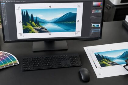
A screen is a grid of tiny lights. Red, green, and blue shine at you directly, and when all three run at full blast you get white. That is additive color, and it works because the screen is generating its own light source. It is a small lamp pointed at your face.
Print is the opposite. Ink does not emit anything. It absorbs some wavelengths of light and reflects the rest back to your eye, which is why a printed piece goes dark when you turn the lights off and a monitor does not. Cyan, magenta, yellow, and black each subtract part of the spectrum. Stack them all and you get muddy near black, not white. White in print is simply the material showing through.
So you have a self illuminated additive system on one side and a reflective subtractive system on the other. Asking them to match exactly is like asking a stained glass window to match a painting of the same scene. Similar image, different physics.
/Some colors are out of reach permanently
Every color system has a gamut, which is just the range of colors it can physically produce. The RGB gamut of a modern screen and the CMYK gamut of an ink set overlap heavily in the middle and diverge at the edges. The colors that live outside the print gamut are not a printer problem or a profile problem. They are unreachable, and they will stay unreachable.
The usual offenders are the ones customers love most. Bright saturated orange. Electric green. Vivid royal blue and purple. Anything that looks like it is glowing on screen. Those colors are being made by a light source, and ink on vinyl has no light source to work with. What comes out is a duller, slightly grayer version of what the customer saw.
When a color falls outside the gamut, the RIP has to substitute the nearest printable color. That substitution is automatic and it is doing its best, but it means two different bright blues on screen can land on nearly the same printed blue. That is why a customer sometimes says the print “lost the difference” between two elements.
Neons and fluorescents deserve a specific mention because people ask constantly. A standard four color process print cannot make a fluorescent. If a customer needs true fluorescent, that requires special material or spot ink, not a better print of the same file.
/Pantone numbers are how you protect a brand color
If a color matters, send the Pantone number. Not a screenshot, not “match this JPEG,” not “it should be our blue.” A number.
Corporate brand colors are almost always defined as a Pantone somewhere, usually in a brand guide the customer forgot they have. That number gives us a fixed target to aim at instead of guessing from a file whose color was already shifted by whatever program exported it. We still cannot hit every Pantone perfectly in CMYK, because plenty of Pantones sit outside the process gamut too, but we can get you the closest achievable match and tell you honestly when a specific one is going to be a compromise.
Send the number up front, before the job runs. Chasing a brand color after the fact costs a reprint that nobody wants to pay for.
/Proof on the material the job is actually printing on
The same ink at the same settings prints differently on different substrates, and that surprises people more than the RGB conversation does.
Gloss vinyl reflects light off the surface and looks more saturated. Matte vinyl scatters it and reads softer and slightly lighter. Banner vinyl, coroplast, and an ACM panel all absorb ink differently and have different base whites underneath. Mesh has holes in it, which drops apparent density across the whole print. A laminate on top shifts things again, gloss laminate deepening the colors and matte pulling them back.
So a proof printed on paper tells you the image is right. It does not tell you what the color will look like on a 3×8 banner. If a job is color critical, ask for a proof on the real material. It costs a little and it settles the question before you commit to a full run.
/Lighting changes what people see
The last variable is not in the file or the printer at all. It is the room.
A print viewed under warm indoor lighting, under cool office fluorescents, in shade, and in direct midday sun looks like four different colors to the human eye. The print never changed. The light hitting it did. Two colors that match under one light source and diverge under another is a known effect, and it is exactly why a sign approved indoors sometimes looks wrong the moment it goes up outside.
Practical version: judge color in the light where the sign is going to live. If it is going outdoors, walk it outside before you decide it is wrong.
/What to send us, and what to tell your customer
Send a print ready PDF with the color mode you actually want, Pantone numbers called out for anything brand critical, and a note on which material it is printing on. Tell us up front if a specific color is the whole point of the job, because that changes how we handle it.
Then set the expectation with your customer before you take the deposit. Tell them screen and print are different systems, that we will get very close, and that “very close” is the honest ceiling for anybody in this industry. Customers accept that easily when they hear it first. They accept it badly when they hear it as an excuse after delivery.
More on color and file setup is in the artwork, files, and color section of our FAQ, or call us at 563.296.8386 before the job runs if a color is critical. SignTeam is a wholesale trade printer, so if you are a sign shop or reseller, browse wholesale vinyl and adhesive pricing here. We print, you get the credit.