
SignTeam Production Notes
The 10 Foot Rule: How Big Sign Letters Need to Be
One inch of letter height for every ten feet of viewing distance. That is the working rule, and if you design to it you will be right most of the time.
Ten feet away, one inch letters. A hundred feet away, ten inch letters. Two hundred feet, twenty inch letters. It is simple arithmetic, and almost nobody does it before they lay out a sign.
/Readable and effective are not the same thing
Here is the part that trips people up. Letters are technically readable much farther away than the ten foot rule suggests. Under good conditions, a person standing still, staring directly at a high contrast sign with nothing else going on, can make out one inch letters from well past ten feet.
That does not matter, because nobody reads signs that way.
Real people are walking, driving, talking, looking at their phone, and scanning past your sign at an angle in bad light. The ten foot rule is not the limit of human vision. It is the distance at which a sign registers without effort, in the half second of attention it is actually going to get. Design to the readable limit and you get a sign that people could read if they tried. Design to the ten foot rule and you get a sign that works.
If the sign really matters, go bigger than the rule, not smaller. Doubling letter height roughly doubles the distance at which the sign does its job.
/The driver problem
Traffic is where this gets unforgiving. A car at 45mph covers about 66 feet every second. Think about what that means for a sign on a commercial strip.
By the time a driver notices your sign exists, decides it might be relevant, reads it, and reacts, you are talking a handful of seconds at best, and the sign is only in useful view for part of that. Call it three or four seconds of real reading time, during which the driver also has to keep the car on the road.
Three or four seconds is enough for a few words. It is not enough for a headline, three bullet points, a phone number, a website, a QR code, and a list of services. That sign gets skipped entirely, because the driver’s brain sees a wall of text, decides it cannot process it in the time available, and moves on. A crowded sign does not deliver less of the message. It delivers none of it.
The other half of the math is distance. If drivers first get a clear view of the sign 200 feet out, the ten foot rule says you need 20 inch letters for it to land. Cramming a business name into 6 inch letters on that same sign means it becomes legible at about 60 feet, which at 45mph is under a second. That is not a sign, that is decoration.
/Fewer words, bigger words
The most useful thing you can do for a customer is take words away. Every word you remove lets the remaining ones grow.
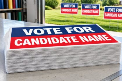
A 4×8 sign with six lines of copy has to run small type to fit. The same 4×8 with three words can run enormous type and read from across a parking lot. Same sign, same cost, wildly different result. The customer usually wants both, and part of the job is telling them they cannot have both.
Ask what the sign is for and make it do exactly one thing. A road sign that has to pull traffic in needs the business name and maybe the category, nothing else. A sign people read while standing at a counter can carry detail, because the viewing distance is three feet and they have time. The mistake is putting counter copy on a highway sign.
Phone numbers and websites on high speed roads are usually wasted space. Nobody is memorizing a ten digit number at 45mph. If people can find you by name, the name is the only thing that has to be readable.
/Contrast does as much work as height
A big letter in a weak color combination loses to a smaller letter in a strong one. Contrast is not a finishing touch, it is half the legibility.
Dark on light and light on dark both work. Black on white, black on yellow, and white on dark blue or dark red are all proven and they hold up in bad light and at bad angles. What fails is colors of similar value: red on black, medium blue on medium green, anything on a busy photographic background. Those combinations look fine on a monitor at arm’s length and disappear at distance, which is exactly the trap, because that is where the design gets approved.
Quick test that costs nothing: look at the design in grayscale. If the letters do not clearly separate from the background with color removed, they will not separate at 200 feet either.
/Font choice, and the drop shadow problem
Use a clean, reasonably bold sans serif for anything that has to be read at distance. Medium to bold weight, normal width, generous spacing between letters.
What hurts legibility: thin weights, which vanish at distance, since a hairline stroke needs the same visual angle as any other detail. Tight letter spacing, which turns words into one blurry shape. Condensed fonts, which buy you horizontal room and cost you readability. Script and decorative faces, which are fine for a logo and bad for information. All capitals for a long line, because word shape is part of how people read, and capitals flatten every word into the same rectangle.
Heavy outlines, drop shadows, and gradients behind text all reduce the contrast between the letter and its background, which is the one thing you were trying to protect. Effects usually make a sign look busier and read worse.
/Do the math before you design
Before laying anything out, ask two questions. How far away is the person who needs to read this, and are they moving? Divide the distance by ten, and that is your minimum letter height in inches. Then check whether the message actually fits at that size on the panel you are quoting.
If it does not fit, you have three options: bigger sign, fewer words, or accept that it will not be read. Most customers pick fewer words once you show them the arithmetic, and the sign gets better because of it.
More on rigid signs and sizing is in the yard signs and rigid signs section of our FAQ, or call us at 563.296.8386 and we will help you size a job before you quote it. SignTeam is a wholesale trade printer, so if you are a sign shop or reseller, browse wholesale aluminum sign pricing here. We print, you get the credit.